The use of colours in the design of retail spaces is not an aesthetic issue, as one would think, but a question of marketing and commerce.
It represents a powerful psychological asset able to change the perception of space, and therefore to influence the customer’s experience and purchase decision.
Colour psychology in retail design
As we have already seen in our article dedicated to the use of colour in home interiors, the psychology that guides the use of certain palettes presupposes that these can influence people’s choices and moods. In the retail context, the choice of colours can be decisive in creating a specific atmosphere or inducing a certain feeling. For instance, blue conveys serenity and confidence, and this means that it is often used by banking and insurance brands, while red, which conveys energy and urgency, is often used in fast-food restaurants or outlet promotions.
The impact colours have on different types of retail spaces
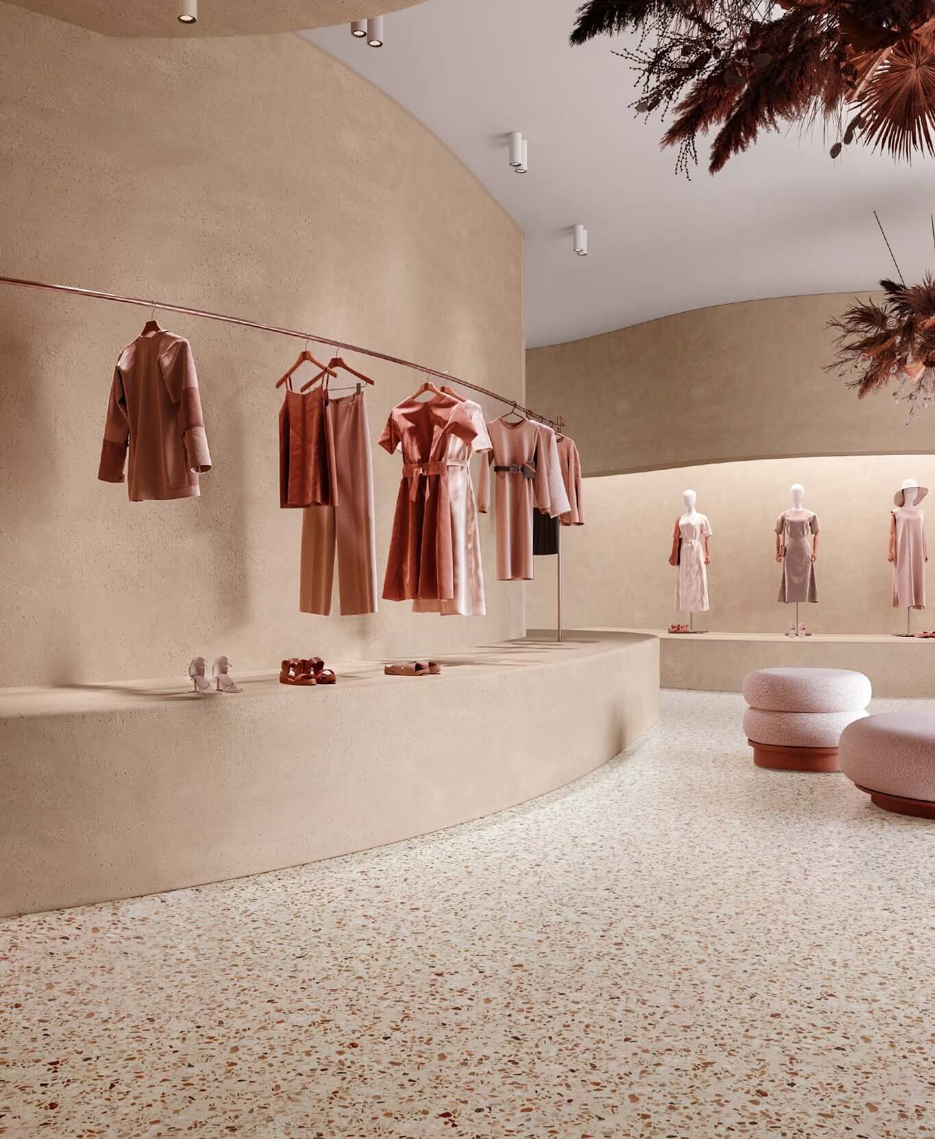
Clothing stores
In the clothing sector, warm toned colours are often used to suggest a sense of excitement and novelty; other times neutral and earthy tones are preferred, to evoke an atmosphere of exclusivity and luxury. A strategic use of lighting also affects the perception of product quality and prices.
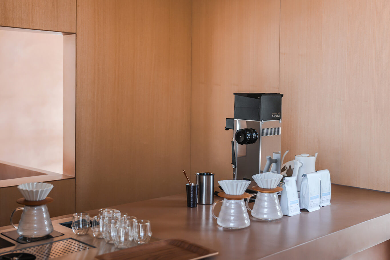
Restaurants and cafes
Colours play a crucial role in the design of restaurants, bars and cafes. It is common knowledge that colours like green and brown evoke sensations of naturalness and freshness. As a consequence, it is not uncommon to find them in places that are associated with a healthy, organic and vegan diet. Conversely, trattorias, sandwich shops and fast-food restaurants make extensive use of colours such as orange and red. As reported by a research led by the University of Parma and published in the magazine Appetite, in fact, these shades have the power to stimulate appetite.
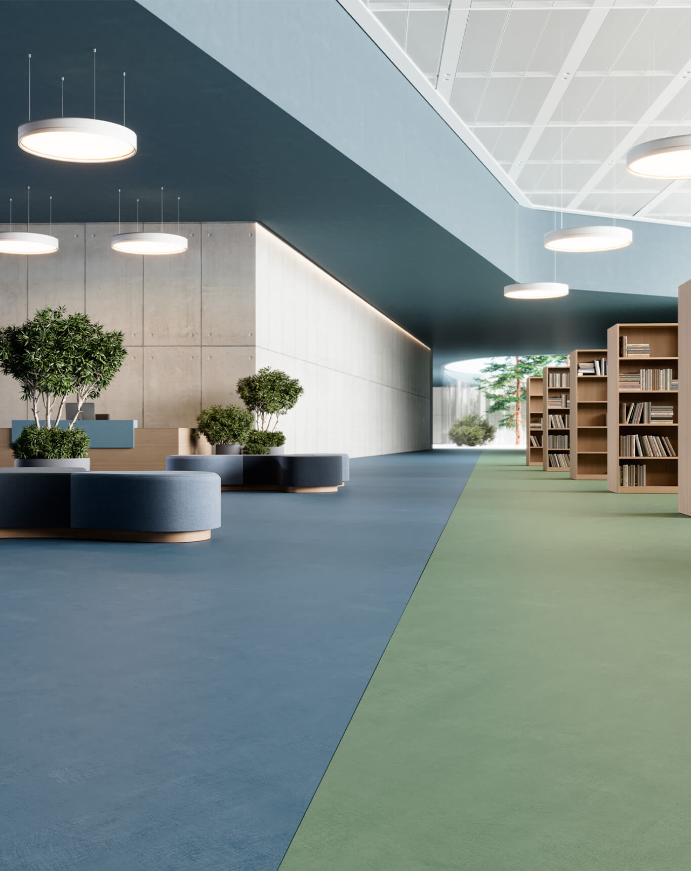
Offices and Corporate Spaces
According to chromotherapy theories, colours can determine the attitude of people in corporate spaces. In offices, for example, colours can influence the productivity and well-being of employees. Colours like blue and green improve concentration and reduce stress, proving optimal for work environments. On the other hand, bright tones like yellow or orange can stimulate creativity, and are therefore suitable for meeting rooms and creative spaces.
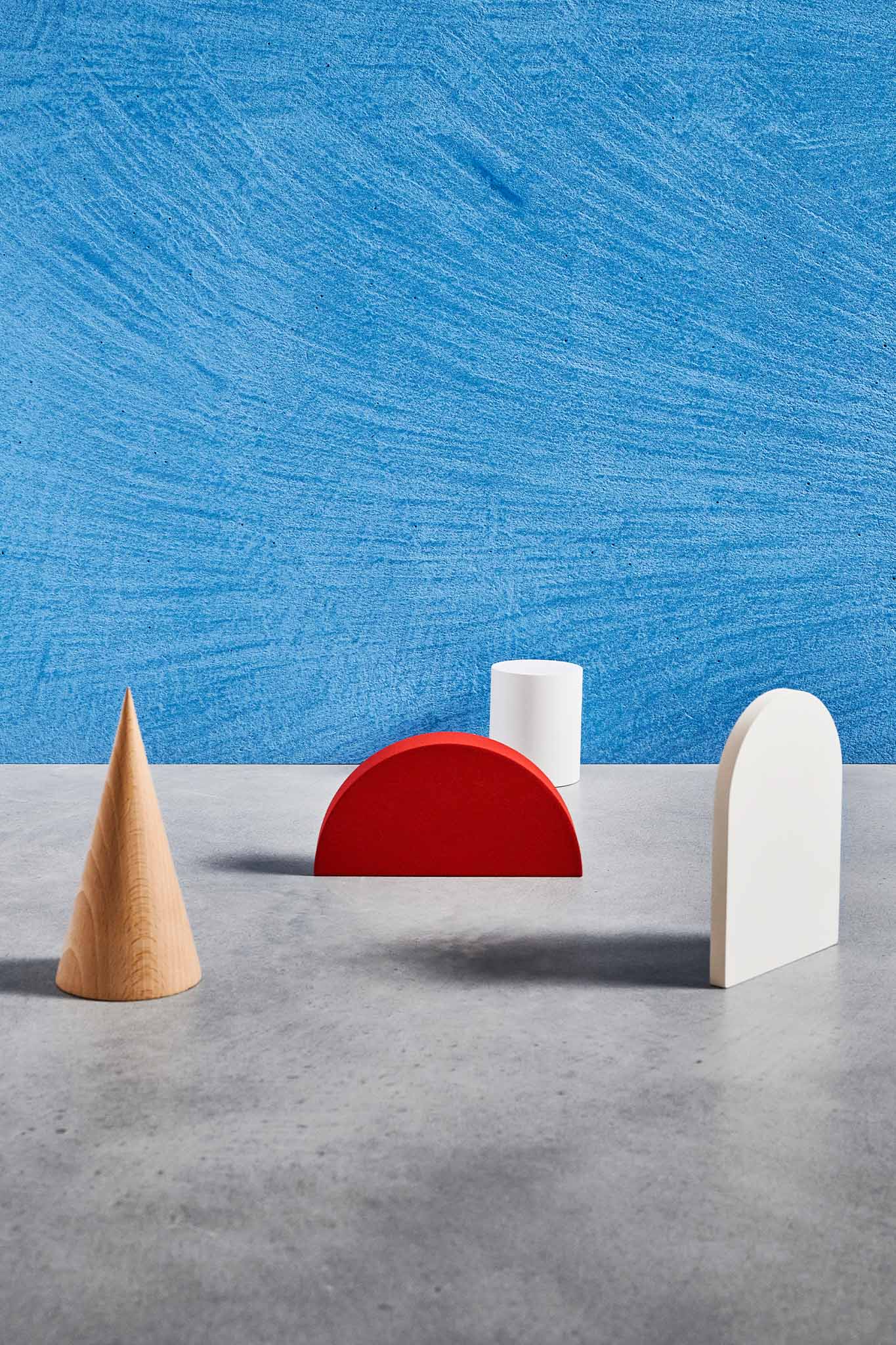
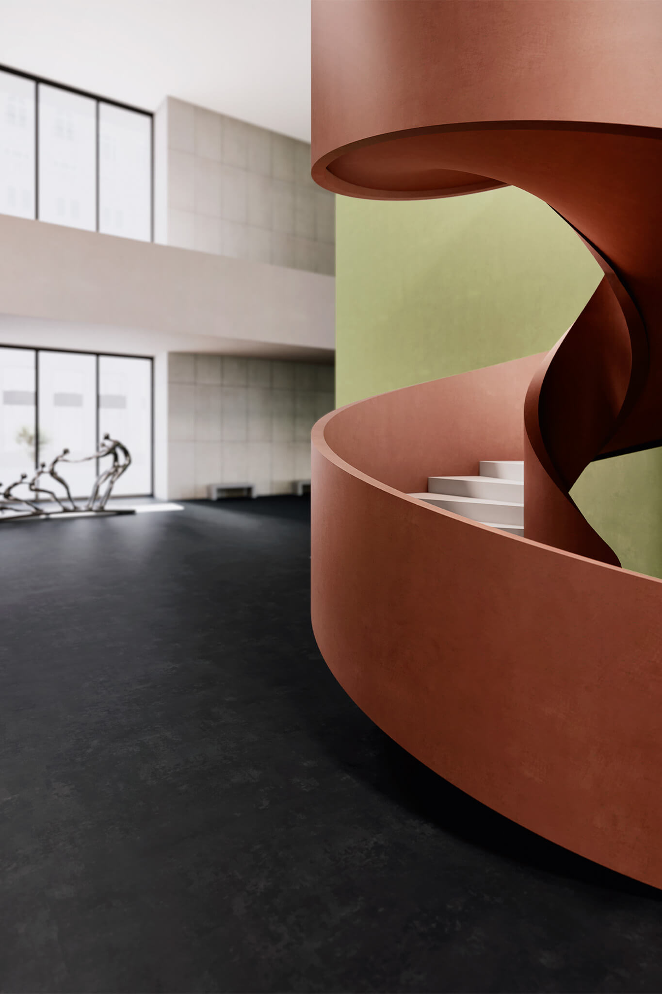
How colours affect the perception of space
The physical perception of space can also be significantly altered by the use of colours. Light, bright tones can make a space look larger and airier, while dark colours tend to visually reduce its size. This concept can be used strategically to change the perception of certain areas within a commercial space, highlighting or downplaying specific elements.
Colour implementation strategies
Market Target Analysis
Before choosing a colour palette, it is essential to understand the target market and the intended use of the environment. Factors such as age, gender, cultural preferences and daily habits must be taken into account. Only in-depth research on these aspects will be able to guide the selection of the most effective colours for the specific target audience.
Consistency with brand identity
The chosen colours must be in line with the identity and values of the company or brand. This helps build brand recognition and also creates a consistent and cohesive experience for the customer. Consistency in colours across all points of contact with customers strengthens brand memory and builds trust.
Using contrasts and accents
The use of contrast and diversification can drive customers’ attention to specific areas or products. This is particularly useful to highlight promotions, novelties or bestsellers (in bookstores, for instance). A well-planned balance between base colours and colour accents makes the experience of navigating a retail space intuitive and enjoyable.
Ideal Work colours and design
We have shown how crucial the ability to personalise spaces through the use of colour is on the scene of contemporary retail design and architecture.
From such a perspective, Ideal Work presents a wide range of colour options and unique textures capable of transforming and customising any surface. From the delicate and natural shades of the Terrae line, inspired by the earth and natural landscapes, to the textures of microcement, and all other dynamic and versatile solutions available, Ideal Work offers a universe of possibilities to create retail spaces that capture the attention and stimulate the imagination.
Our meticulously designed colour collection allows to create environments able to reflect a brand’s identity, enhance user experience and blend with the surrounding architecture. Each shade is not only designed to offer wide aesthetic possibilities but also to guarantee durability and resistance — two fundamental qualities for retail spaces. Ideal Work’s approach to surface colours testifies to the company’s commitment to research and development of cutting-edge solutions, capable of satisfying the needs of the most demanding professionals as well as anticipating design trends.
Find out more about our offer and draw inspiration for your next project by visiting Ideal Work – Colours or by contacting us.