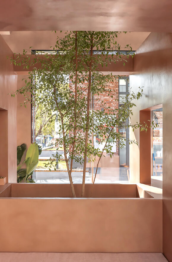
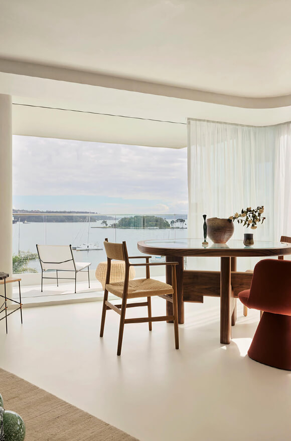
Owing to the COVID-19 pandemic the world is experiencing an unprecedented period of transition. This period of change has shaped our lives and our tastes, including those related to design colours. In fact, thanks to the lockdown, attention to home design has become a priority. Living in a home environment where one can move and express themselves with freedom and inspiration — a haven of well-being and a multifunctional place where it is possible to combine work, interests, active time and relaxation — has become more and more important. In such interior environment, colour plays a key role, as it conveys one’s personal style, as well as a certain type of vibes. Every shade, in fact, refers to a specific emotion, as we saw in our article “Behind the colour: chromatic lines and the psychology of environments“).
What are the most sought-after colours after the pandemic and what are 2023 interior design trends? According to the well-known trend forecasting agency WFS and the studies conducted by the Pantone Color Institute, we two particular directions emerge: one prefers suffused, enveloping shades, which evoke tranquility and serenity, and the other favours more vibrant and daring colours, which communicate energy, optimism and a strong personality. Let’s see them together in this article.

Post-pandemic colours: shades to convey serenity and kindness.
After such a troubled period, many people are now looking for colours that inspire tranquility, serenity and rebirth. Here are the trends identified by the analyses conducted by WFS and the Pantone Colore Institute for 2023.
Green
As a symbol of regeneration, health and nature, green has become a popular choice. There has been an increase in demand for relaxing green shades such as sage green and olive green, but also particular attention to what Pantone defines as “Classic Green“: a vivid, fresh and lush green — a symbol of recovery and vitality.

-
Blue
The peaceful and regenerating atmosphere conveyed by green transitions into a wide range of blue shades such as Pantone’s “Perennial Blue“, which recalls spring blossoming. Blue creates a relaxing atmosphere that evokes calm, stability and rebirth, and brings together the furniture with the other elements of the interior.
Pink
Another increasingly popular colour is the delicate “Crystal Rose“: a light pink, bearer of a contemporary romantic character, which recalls kindness, poetry and delicacy, without appearing obvious or cloying. It belongs to an elegant and sophisticated palette, which also includes antique pink, dusty grey and graphite black. Pantone’s Crystal Pink gives depth and refinement to the most eclectic and contemporary interiors.